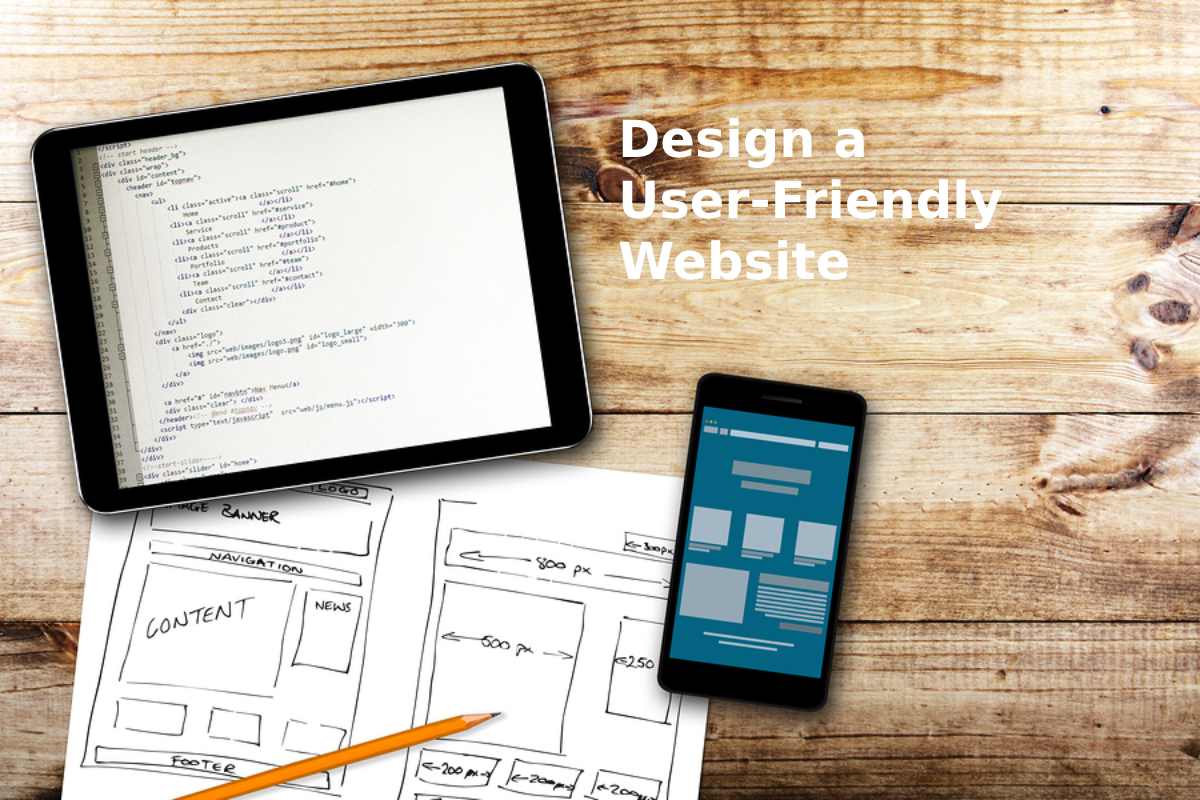
Best Practices to Design a User-Friendly Website – The task of every online store is sales. So how can UX design help us with this?
UX is not only the correct structure of the site, it is the ability to make the site simple and convenient, which, thanks to the usability and visual beauty of the UI, will be able to enable users to fulfill their goals in just a few clicks. Today we are going to take a look at the main UI design trends used by many atlanta web design companies.
What is E-commerce?
To begin with, let’s remember in a few words what E-Commerce is – it is a solution that helps you buy goods/services on the Internet.
The main, but far from the only, plus of e-commerce in the absence of geographic restrictions. Collaboration with logistics companies will help reach an audience on a global scale. This is how e-commerce giants such as AliExpress, Alibaba, eBay, Amazon, Zappos, iTunes operate.
How is UX Applied in E-commerce?
First and foremost – remember that User Experience is used not only for websites but also for products or software.
User experience is a concept related to the impressions and emotions obtained as a result of using a particular product.
Basically, we are doing research on how the website meets the needs of the customers.
Why is this so Important?
Mainly due to such reasons:
A good User experience brings more money to the business and sales grow: therefore, if a happy user is a happy user, so is the business owner.
And also UX brings more traffic: and this is very important since it is directly related to user experience (user interaction with the site).
Several Best Practices for User Experience UX Design in e-commerce.
Now you can see why, without a well-thought-out eCommerce UX part, almost any website can be ineffective. And the most important thing is to determine what exactly influences and determines the good or bad UX for your particular online store. Sometimes, it’s very difficult to do this by yourself, so many business owners decide to go with reliable e-commerce development companies that are always ready to help improve your website.
By understanding how users move around your site or web application, we can go over and familiarize ourselves with the basic UX design practices for eCommerce.
1. Position your Brand Clearly
The first thing most important for e-commerce is proper brand positioning. Every detail of your online store should be consistent with your brand concept, and the site should be user-centric. This is influenced by many aspects of design, from choosing the right colors, typography, to creating an easy way to navigate your site.
2. Develop Intuitive Navigation
Intuitive and/or user-friendly navigation is what helps users navigate through all stages of the sales funnel. Currently, due to the fact that there are a large number of sites that already bring millions and billions of sales, do not hesitate and you can just copy the ready-made UX patterns, slightly redoing and decorating them in accordance with your brand book.
3. Provide Full Search and Filter Capabilities
As soon as a user visits your site, first of all, you need to make sure that the client instantly understands the sections, products, where and how to search for them, how to sort and filter.
Based on this, the advice was born that the search field should be accessible from anywhere and clearly visible on your site/application. If you have a popular online store that has dozens or hundreds of new products every day, then you cannot do without a search with a convenient filter, as they will help you navigate your assortment even faster and with greater accuracy.
4. Add Featured Products
As I said before, a good and well-thought-out UI / UX can help drive more visitors to your site and drive them through the sales funnel. Therefore, adding a Featured Products section to your site is very important.
5. Call the User to Action
CTA is what motivates the user to take some action, be it a purchase or registration, and also helps to lead users to the next stage, namely the sale. But do not overuse the CTA on the site, as it is not a good idea and can, on the contrary, worsen sales.
With these tips, you can easily make your website one of the best and most practical.
Also Read: Axie Tech Tool Partner \for Axie Infinity


